The Challenge
Blood pressure management starts with understanding—but health information can feel technical, overwhelming, or disconnected from everyday life.
For Amazing Health Partners Clinic, the challenge was to bring blood pressure education, practical guidance, and connection to care into one approachable resource. The pamphlet needed to help patients understand why blood pressure matters and feel more prepared to take part in conversations about their health.
The Goal
Create a patient education pamphlet that supports understanding, encourages conversation, and gives readers a clear place to start.
We wanted the resource to help people connect health information to their own lives: what may affect their blood pressure, which everyday habits they can discuss with their care team, and what questions they may want to ask their provider.
The goal was simple: make the information useful beyond the moment someone reads it.
Our Approach
We organized the content around four steps:
Understand → Recognize → Manage → Connect
Understand — Explain why blood pressure matters in clear, familiar language.
Recognize — Help readers recognize the health and lifestyle factors discussed in the pamphlet and consider how they may relate to their own experiences.
Manage — Bring the information into everyday life through practical topics such as eating, movement, sleep, and stress.
Connect — Encourage readers to ask questions and continue the conversation with their healthcare provider.
Together, these steps give the resource a clear direction—from learning about blood pressure to exploring what comes next.
From Health Information to Health Communication
We wanted readers to see more than a blood pressure number. We wanted them to understand how the information connects to their routines, questions, and care.
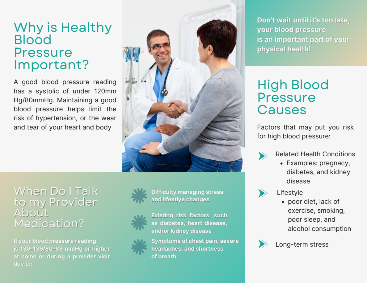
The content was organized into short sections built around questions patients may have, including “Why Is Healthy Blood Pressure Important?” and “When Do I Talk to My Provider About Medication?”
This gave each section a purpose and made the information easier to navigate. Readers could find a starting point, focus on a question, and return to the resource when they needed it.
For Nightingale, that is where thoughtful health communication begins: understanding what people need from the information and shaping it around those needs.
The Design
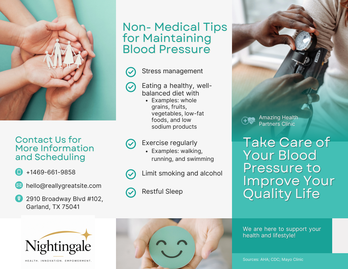
The trifold format brings the content into manageable sections, creating a resource patients can take home and revisit.
A teal color palette establishes a consistent visual identity. Photography of blood pressure measurement, supportive hands, and patient-provider interaction connects the subject to people and care.
Short headings, icons, bullet points, and clearly separated sections were used to support scanning and guide readers through the content. Each design choice served the same goal: make the information feel approachable and easier to follow.
The Solution
The finished pamphlet brings health education, creative design, and clinic information into one patient-facing resource.
Know why it matters. • Understand what affects it. • Support your health. • Connect with care.
The resource introduces blood pressure management as an ongoing conversation. Clinic contact and scheduling information give readers a direct way to continue that conversation with their care team.
The Nightingale Perspective
We believe health information should feel simple and human.
That means thinking about the person reading it—their questions, their experiences, and what would help them understand and use the information.
This project brings that belief into practice through thoughtful content and purposeful design, with a focus on clarity, connection, and patient empowerment.
Health. Innovation. Empowerment.