The Challenge
A meaningful awareness campaign starts with connection. For CLIPT’N, that meant bringing Breast Cancer Awareness into a message that felt natural to a cycling and performance brand.
The campaign needed to communicate support, introduce the apparel, and reflect the brand’s focus on making performance wear more attainable. Each post also needed its own purpose while feeling like part of the same story.
The challenge was to bring these messages together in a way that felt thoughtful, recognizable, and relevant to the people seeing them.
The Goal
Create a social media campaign that connects Breast Cancer Awareness with CLIPT’N’s identity, products, and community.
We wanted people to recognize the purpose behind the campaign while seeing how the apparel could fit into their own riding routines.
The goal was to make room for both the message and the product, with clear communication connecting the two.
Our Approach
We organized the campaign around four ideas:
Awareness → Performance → Access → Community
Awareness
Make Breast Cancer Awareness a clear and consistent part of the campaign through color, imagery, and messaging.
Performance
Connect the apparel to movement and cycling through athletic imagery and product details.
Access
Reflect CLIPT’N’s aim to make quality performance wear feel more attainable.
Community
Bring people and shared experiences into the story, with messages centered on hope, participation, and support.
Together, these ideas gave the campaign a clear direction while allowing each post to communicate something different.
From Awareness to Connection
We considered how the awareness message would fit into the full campaign—from the words people read to the products and activities they saw.
Pink ribbons, a black-and-pink palette, and supportive language made the theme recognizable. Cycling imagery connected that theme to CLIPT’N’s audience.
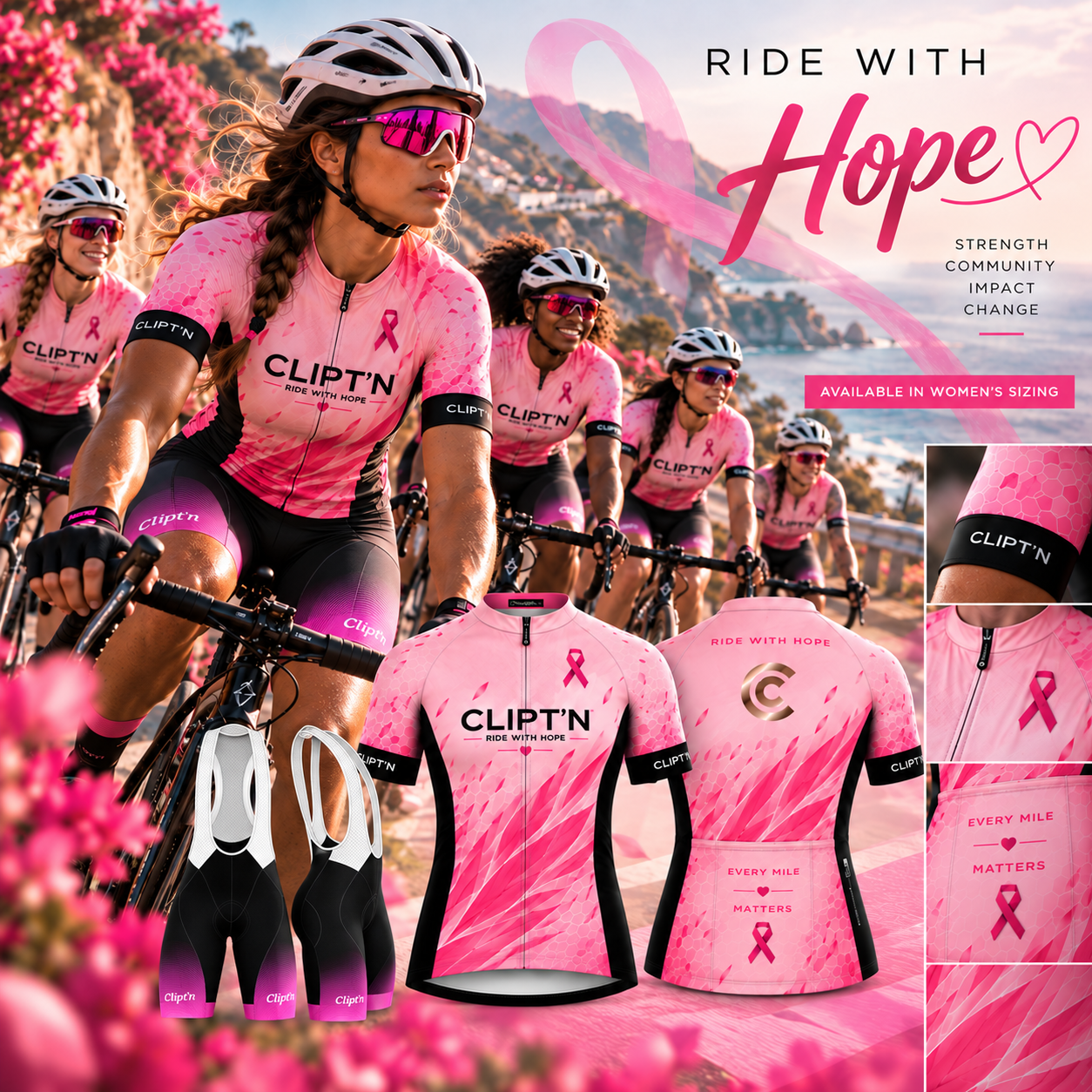
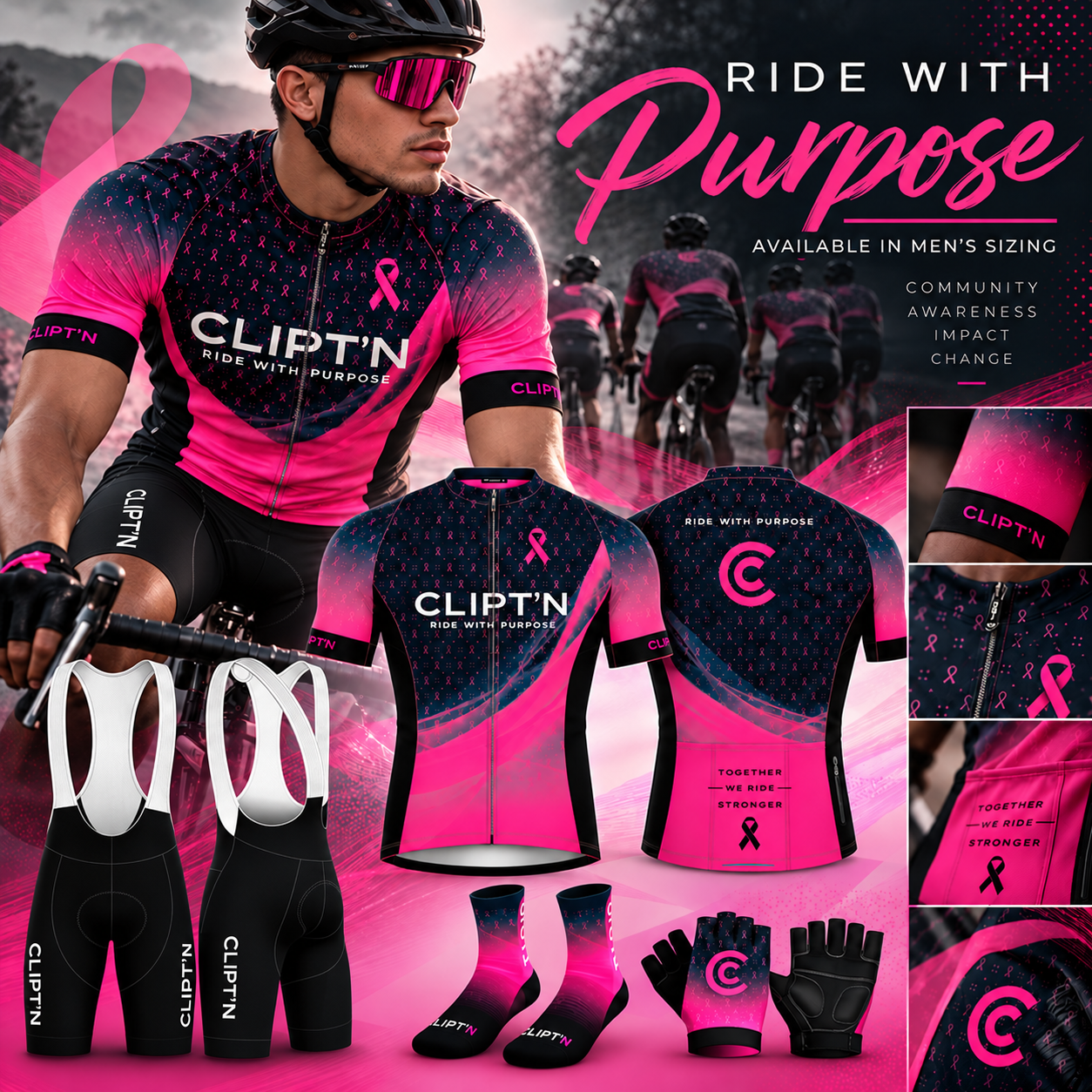
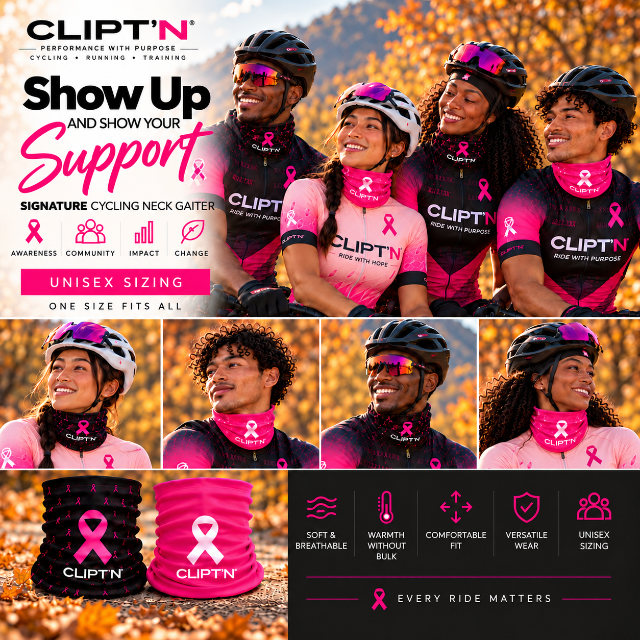
Messages such as “Ride With Hope,” “Ride With Purpose,” and “Show Up and Show Your Support” gave each post a distinct focus. Some emphasized encouragement and togetherness; others brought attention to movement and the apparel.
For Nightingale, that connection matters. The words, visuals, and purpose should work together so people can understand what a campaign is communicating.
The Design
A consistent palette of pink, black, and white ties the campaign together. Bold typography, ribbon details, athletic imagery, and product close-ups help establish a recognizable look across the posts.
Within that shared style, each piece has room to tell its own story.
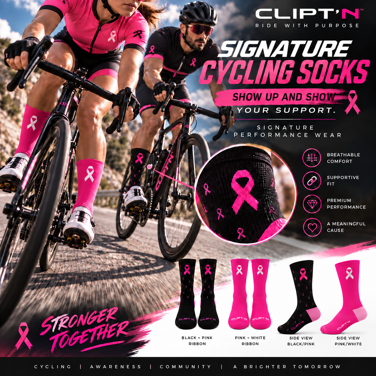
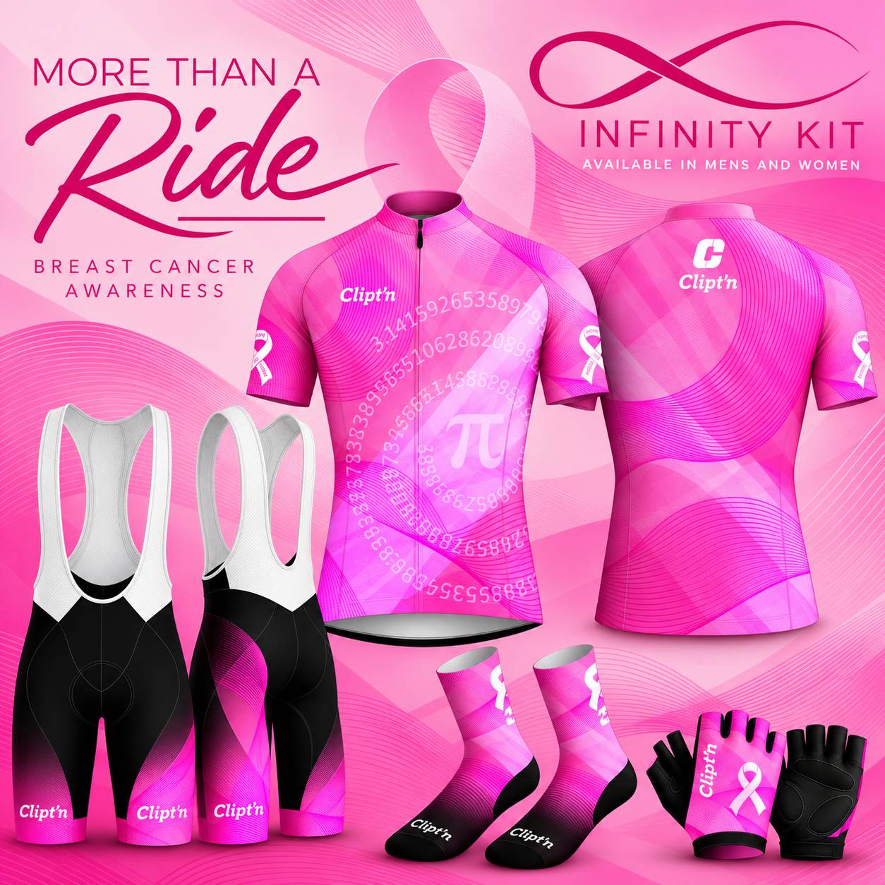
Road-cycling imagery brings movement into the campaign. Seasonal settings give context to the neck gaiter. Product layouts highlight the socks and Infinity Kit, showing individual details alongside the wider collection.
These choices create variety while keeping the campaign connected.
The Product Story
We wanted people to see where the apparel fits into everyday movement.
Jerseys, bibs, neck gaiters, cycling socks, and gloves appear through cycling imagery or product-focused views. This gives the audience a clearer connection between what they are seeing and how they might use it.
The messaging highlights the brand’s stated product features, including comfort, breathability, and warmth, while reflecting its focus on attainable performance wear.
The awareness theme stays present throughout, giving the product story a shared purpose.
The Solution
The finished campaign brings awareness messaging, product marketing, and creative design into a coordinated set of five social media posts.
Awareness • Performance • Access • Community
Each piece offers a different way into the story while sharing the same visual identity and direction. Together, they give CLIPT’N a consistent way to introduce its apparel and communicate its Breast Cancer Awareness theme.
The Nightingale Perspective
Thoughtful communication begins with understanding what needs to connect: the message, the audience, and the purpose behind the work.
For this project, that meant considering how awareness and product storytelling could sit together in a way that felt clear and intentional.
Through focused messaging and purposeful design, the campaign brings CLIPT’N’s products and community-minded positioning into one connected story.
Health. Innovation. Empowerment.