The Challenge
Prevention starts with understanding. But information about type 2 diabetes can feel like a lot to take in—from risk factors and screening to everyday habits and conversations with a healthcare provider.
The challenge was to bring these pieces together in a resource that felt approachable and useful. We wanted readers to find information that connected to their lives, understand the main message, and have a clear place to start.
The Goal
Create a concise educational resource that helps adults understand type 2 diabetes prevention and feel more prepared to take part in their health.
The resource needed to introduce risk factors, encourage conversations about screening, and present practical ways to support health. It also needed to leave room for individual experiences and circumstances.
Our goal was to encourage action without placing blame. Prevention communication should recognize that people’s health is shaped by more than personal choices.
Our Approach
We brought together evidence-based content, thoughtful messaging, and creative design around four questions:
What affects my risk? → What should I know? → What can I do? → Where do I start?
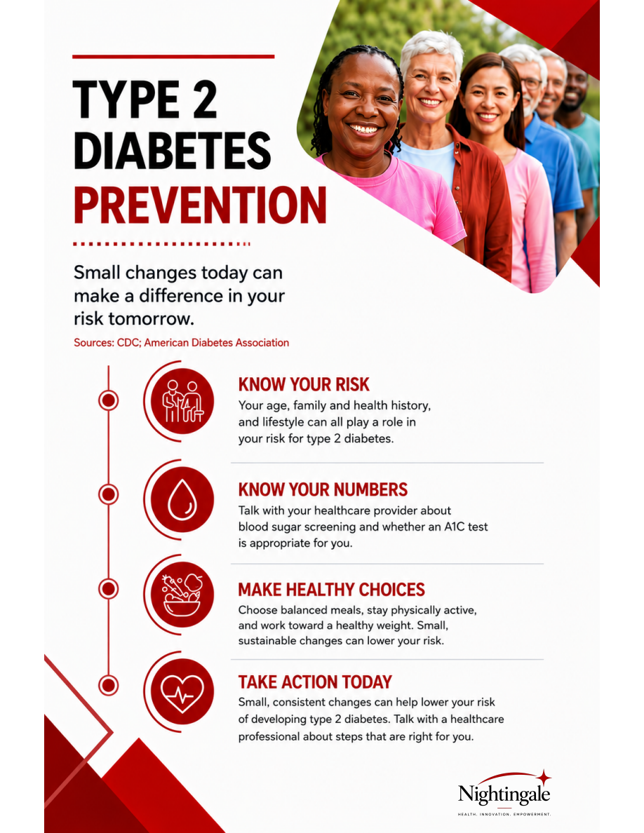
Know Your Risk
Introduce the different factors that contribute to risk, giving readers context for a conversation about their own health.
Know Your Numbers
Encourage readers to ask their healthcare provider about blood sugar screening and which tests may be appropriate for them.
Make Healthy Choices
Connect prevention information to familiar parts of everyday life, including meals, movement, and individual health goals.
Take Action Today
Give readers an encouraging next step: start a conversation, ask questions, and explore an approach that fits their needs.
Together, these sections create a clear path through the information while keeping the person reading it at the center.
From Evidence to Communication
Choosing what to include was only part of the work. We also considered how the information would feel to someone encountering it.
We used short, direct messages and organized the content into four recognizable actions. Each section had a purpose, helping readers move through the resource without having to take in everything at once.
We paid particular attention to how risk was described. The messaging acknowledges age, family and health history, and lifestyle, giving readers a broader understanding of the topic.
For Nightingale, clarity means making information easier to understand while preserving the context people need to use it.
The Design
The design gives the message a clear direction.
A red, black, and white palette creates contrast, while icons help readers distinguish between the four sections. A vertical pathway connects the content and guides the eye from one step to the next.
The opening message—“Small changes today can make a difference in your risk tomorrow”—sets an encouraging tone. Short headings and focused text keep the resource easy to scan, with each section building on the one before it.
The visual choices support the same purpose as the writing: help people find, follow, and connect with the information.
The Solution
The finished resource brings health education, communication strategy, and graphic design into one focused piece.
Understand your risk. • Know your numbers. • Make informed choices. • Take action.
It gives readers an introduction to prevention and a starting point for further conversation. The information is organized to support understanding, invite questions, and connect learning with a meaningful next step.
The Nightingale Perspective
We believe health information should feel simple and human.
That means considering what people need to know, how the message may land, and what would help them use it in their own lives.
This project reflects that approach through thoughtful content and purposeful design—making prevention information more approachable while keeping clarity, connection, and empowerment at the center.
Health. Innovation. Empowerment.